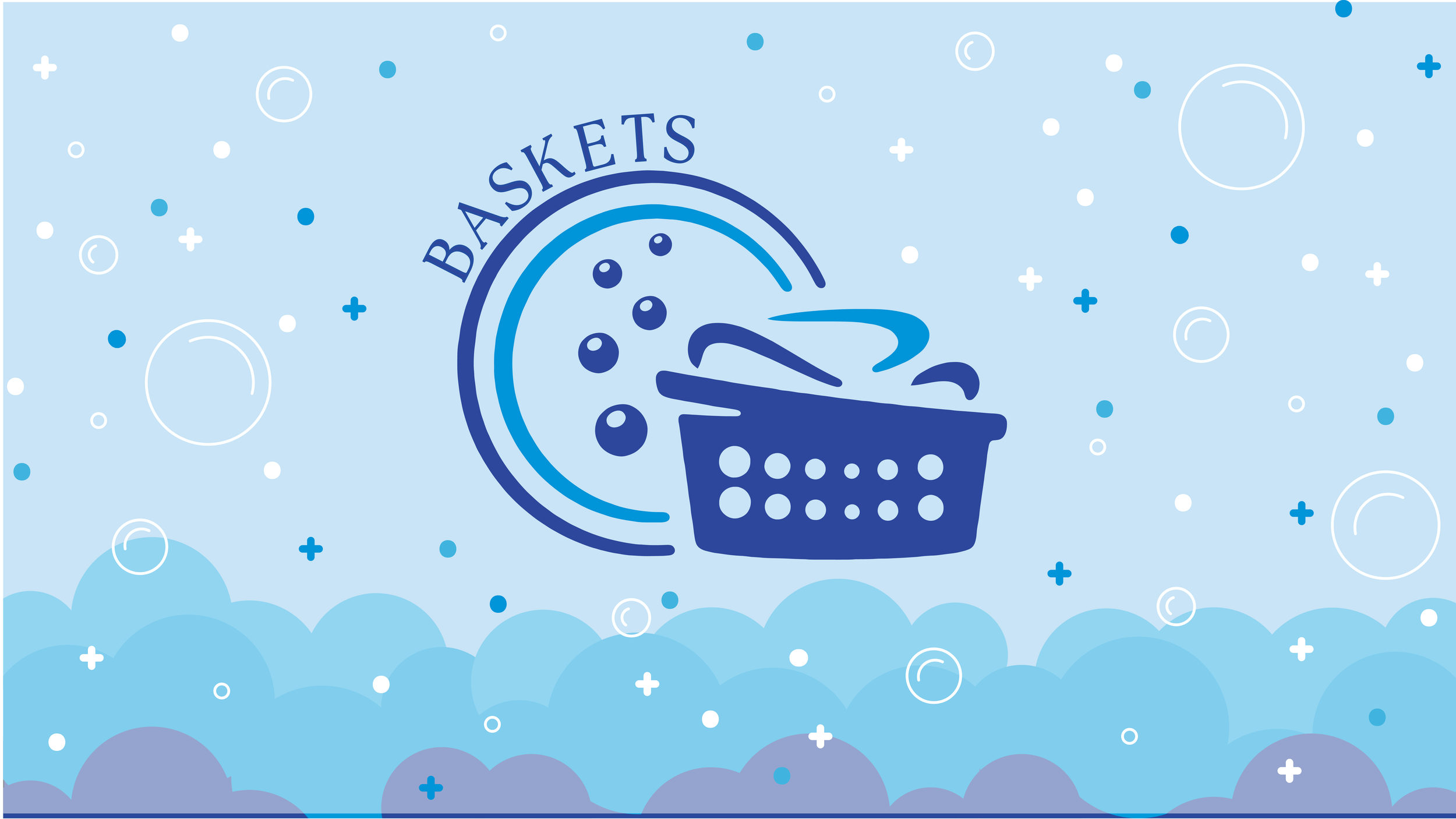
Baskets Laundromat
Wall and Window Graphics
April - May 2023 · Two weeks.
Roles · Illustrator, Designer, Setting up for Print.
Skills · Research, Illustration, Layout, Printing.
Baskets is a laundromat that was looking to have something that could set him apart from other businesses similar to it.
The window graphics are informational and help understand the customer where they are heading at. The wall graphics create a fun experience while waiting inside the laundromat.
Tools · Illustrator, Photoshop
Lead Designer · Melissa Huelvas
Project Manager · Vanessa Bjornoy
Problem
Come up with some graphics that convey a sense of fun that can include a part of the process of laundry. It must fit the brands guidelines (color palette and logo) and it must help
set apart the business from others. As far as the dimensions, something that can engage people but that also can be less expensive than a full coverage option.
Solution
Considering that the business had a time and budget concern, I created a bubbly experience that could easily translate into the space with illustrations and fun typography. One of the main concerns was to keep the wall constrained into a stripe so the budget would not go up. And to have full coverage in the windows to hide the less flattering parts of the business.

Gather Assets, Sketches, layout.
Illustration, layout mockups, feedback.
Set up final version, set up for print.

Wall & Window Graphics
The wall where the graphics would be placed was 54 ft wide. Being so large, the client decided to go against full coverage and instead have something that could be nested on a 3ft tall stripe. The things that needed to be in the design were the logo and the color palette. They did not have an exact idea of what they were looking for, except for having bubbles on the design.
Color Palette
The client had one element that was provided prior the Design, A logo. With this one I was able to create a color palette with the same hue and tints. with some play with the hierarchy of colors i was able to provide a few examples of how the design for the wall and windows will look.


Design Sketch / Versions
Since the only element provided by the client was a logo, i had an open canvas to go wild with my design. Since the large scale wall graphic was going to take some creative thinking to tackle i went ahead and sketch out a couple ideas that later on I converted them into Hi-fi versions to present to the client. Here’s a peek to the process.
Version 1
Version 2

Wall Graphics
The wall where the graphics would be placed was 54 ft wide. Being so large, the client decided to go against full coverage and instead have something that could be nested on a 3ft tall stripe. The things that needed to be in the design were the logo and the color palette. They did not have an exact idea of what they were looking for, except for having bubbles on the design.
With this in mind, I created a design that could have type as part of the image since the space would be so short. I included the bubbles and played around with different illustrations of items that you can find on a laundromat
Version 1 after feedbaack


Window Graphics
Once I took care of the large-scale design, there was already a guide to follow; translating that to a smaller application was easier. For this, the e requirements were slightly different. The design needed to cover the entirety of the window to be able to hide the air conducts from the passerby. And the design needed to have the logo big and centered on the window. .


